Drift + Focus
Brand Identity Design — Layout Design
See the brand in action: Drift + Focus
About the Brand
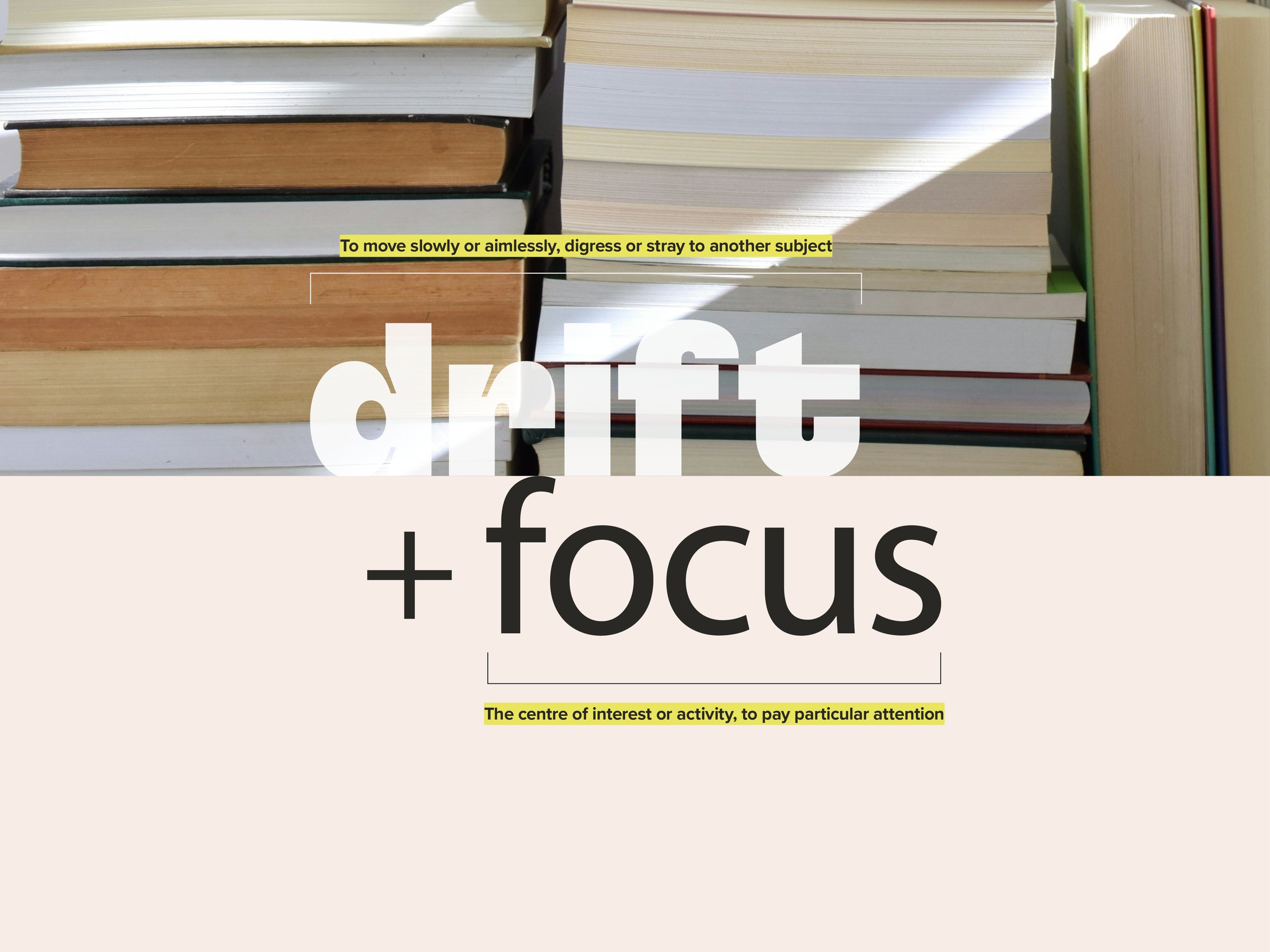
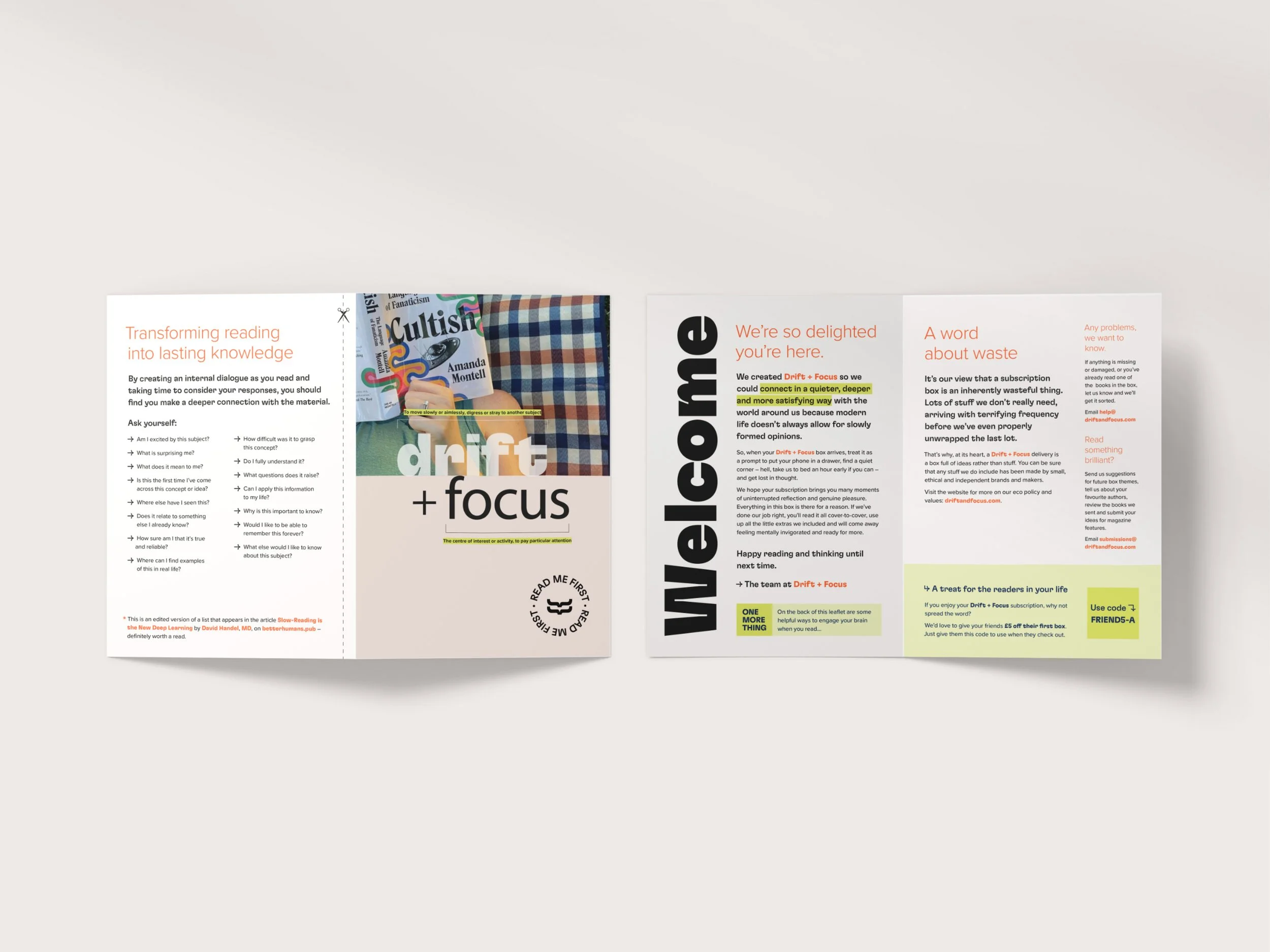
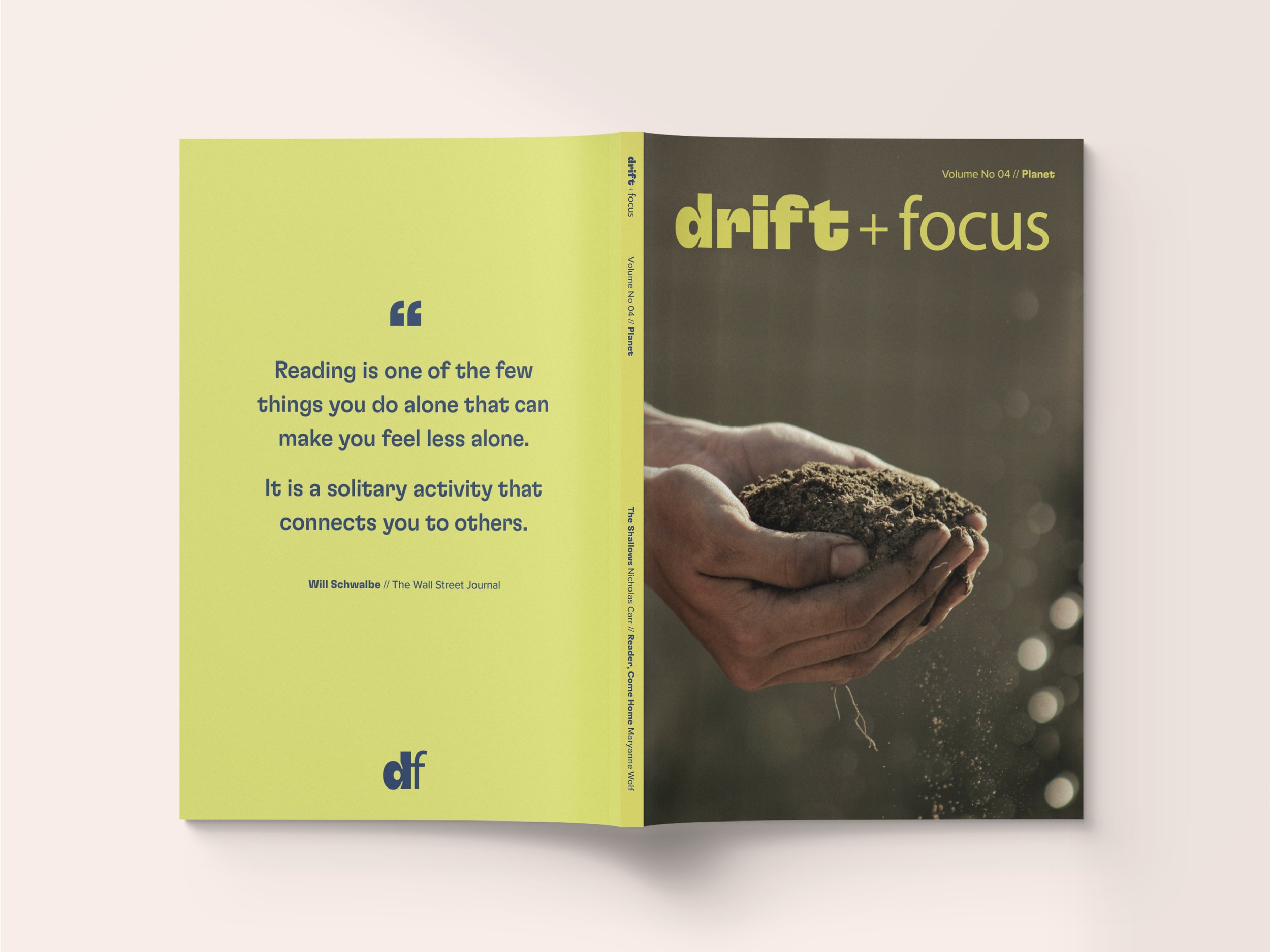
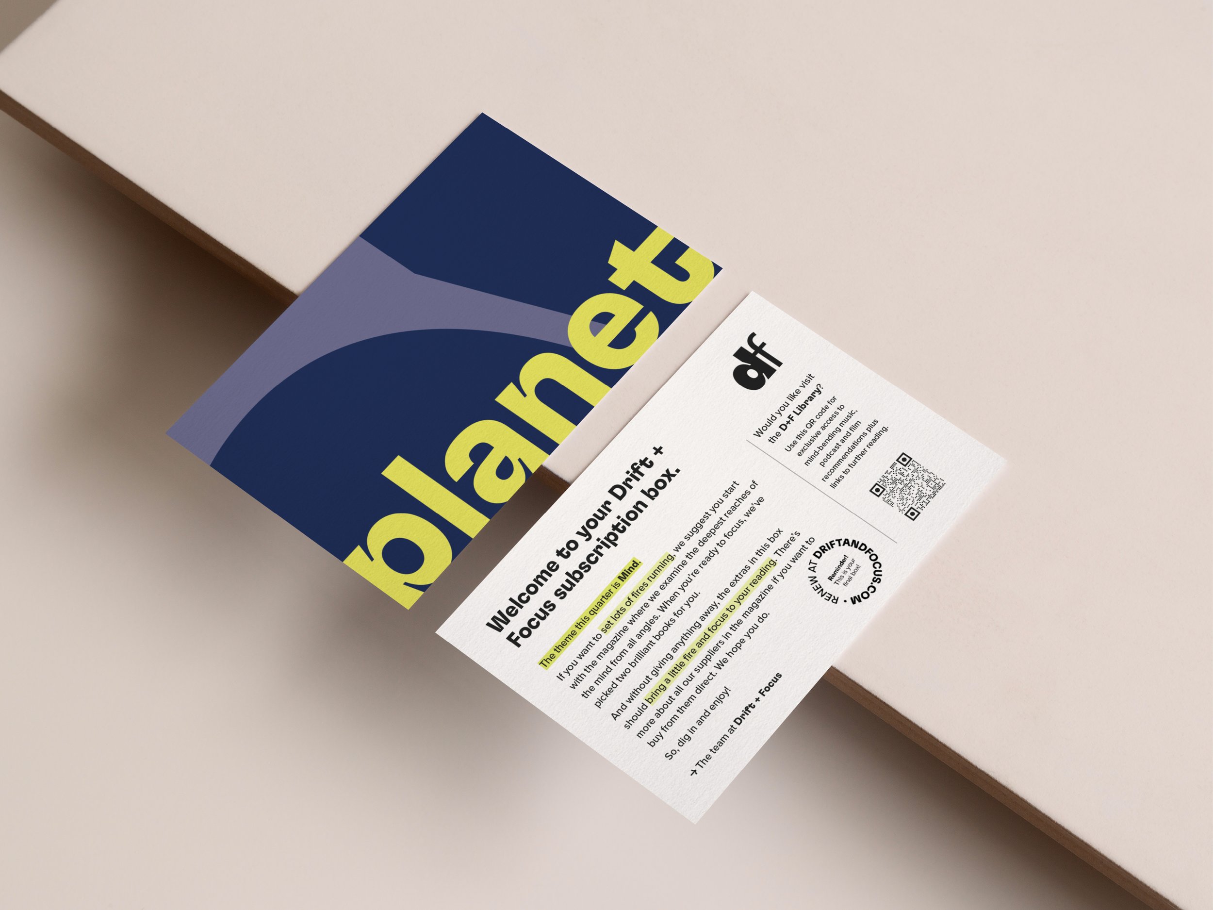
Drift + Focus is a quarterly subscription box for readers that leaves its mark on minds, not the planet. The brand delivers curated parcels of non-fiction reading material along with consciously chosen extras adding an element of surprise to each box.
I worked with Drift + Focus’ co-founder Emma to design an identity that is thoughtfully curated and typographically rich, reflecting a brand that is smart, kind, progressive & inclusive.
Drift + Focus’ logo suite uses lowercase letter-forms for a familiar and friendly feel, while the treatment of each logo word, ‘drift’ and ‘focus’ acts as a nod to their meanings. The brand’s typeface, Flexa is fun and engaging and its recognisable ‘inktraps’ have been highlighted throughout the identity forming a distinctive part of the brand. The brand’s colour palette uses a soft ‘shell’ shade as its hero colour while vibrant ‘lime’ is used to mimic a highlighter and draws attention to important text and brand elements.