Lark + Bower
Brand Identity Design — Icon Design — Layout Design
See the brand in action: Lark + Bower
Photography by Lark + Bower
About the Brand
Lark + Bower is the creation of artist and weaver Sarah Ward. Specialising in creative off-loom techniques, Sarah creates unique thread-based art pieces as well as collaborating with schools, universities, community centres, guilds and craft groups to teach weaving workshops online and in person.
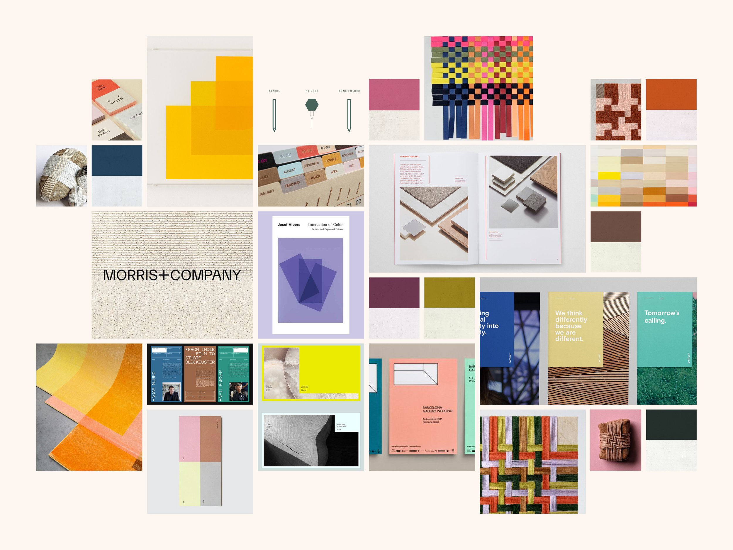
I worked with Sarah to re-brand Lark + Bower to reflect a brand that is creative, process‑minded and community focused.
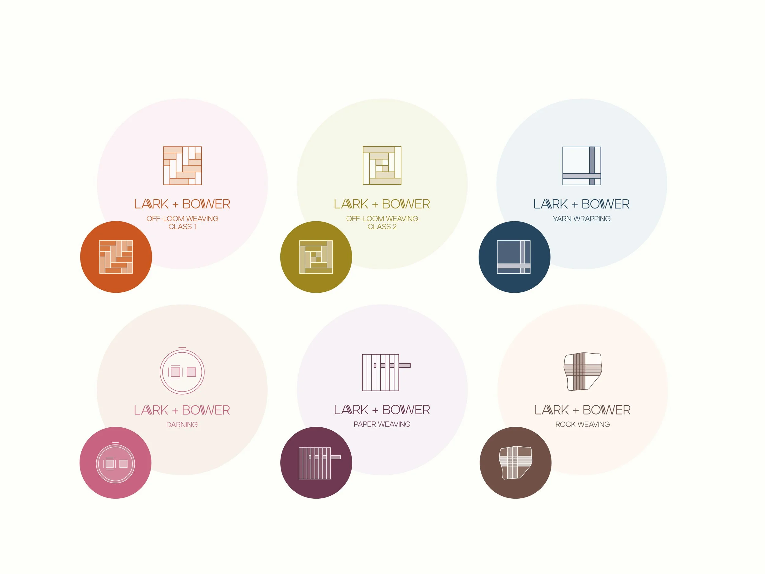
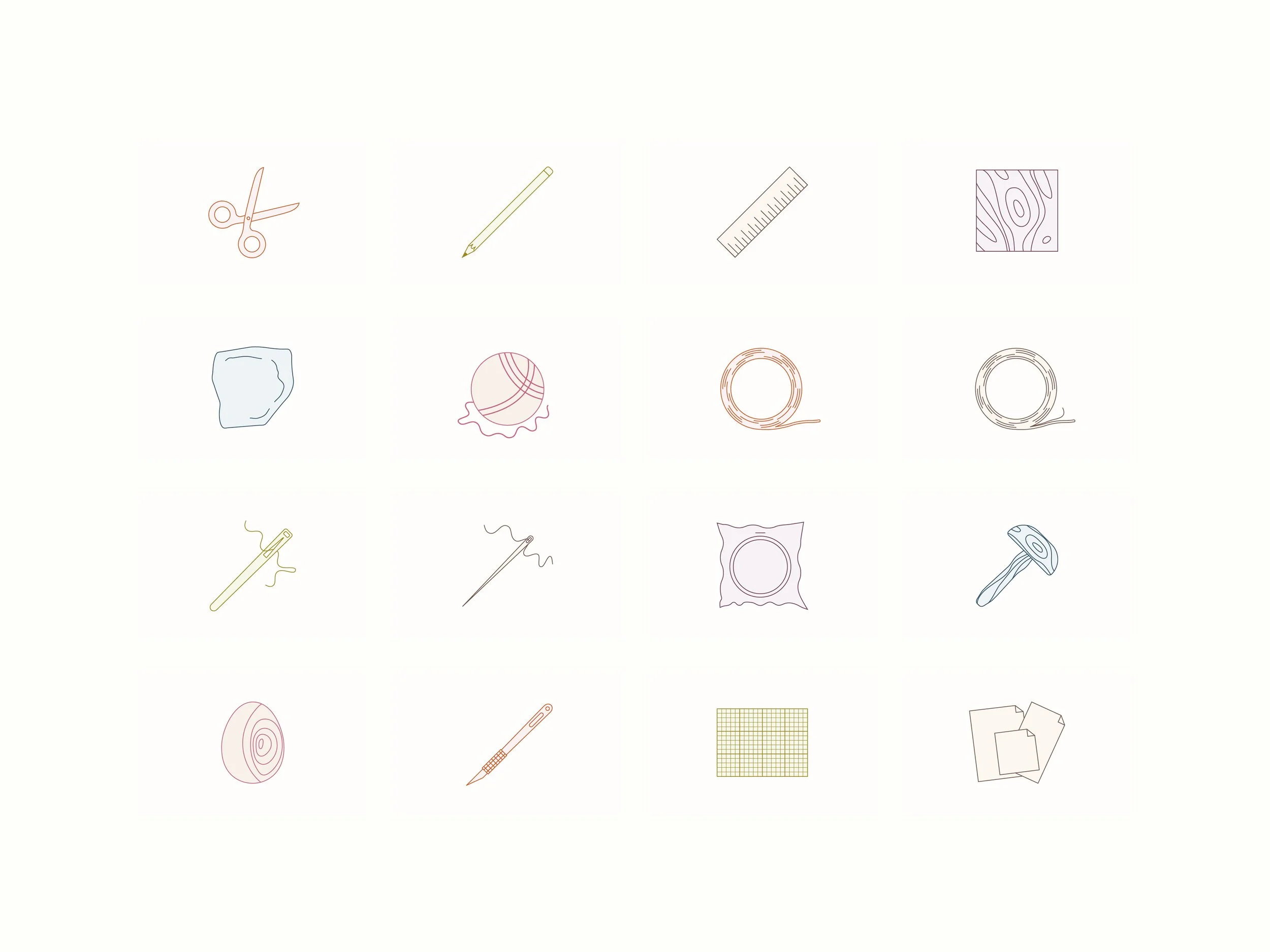
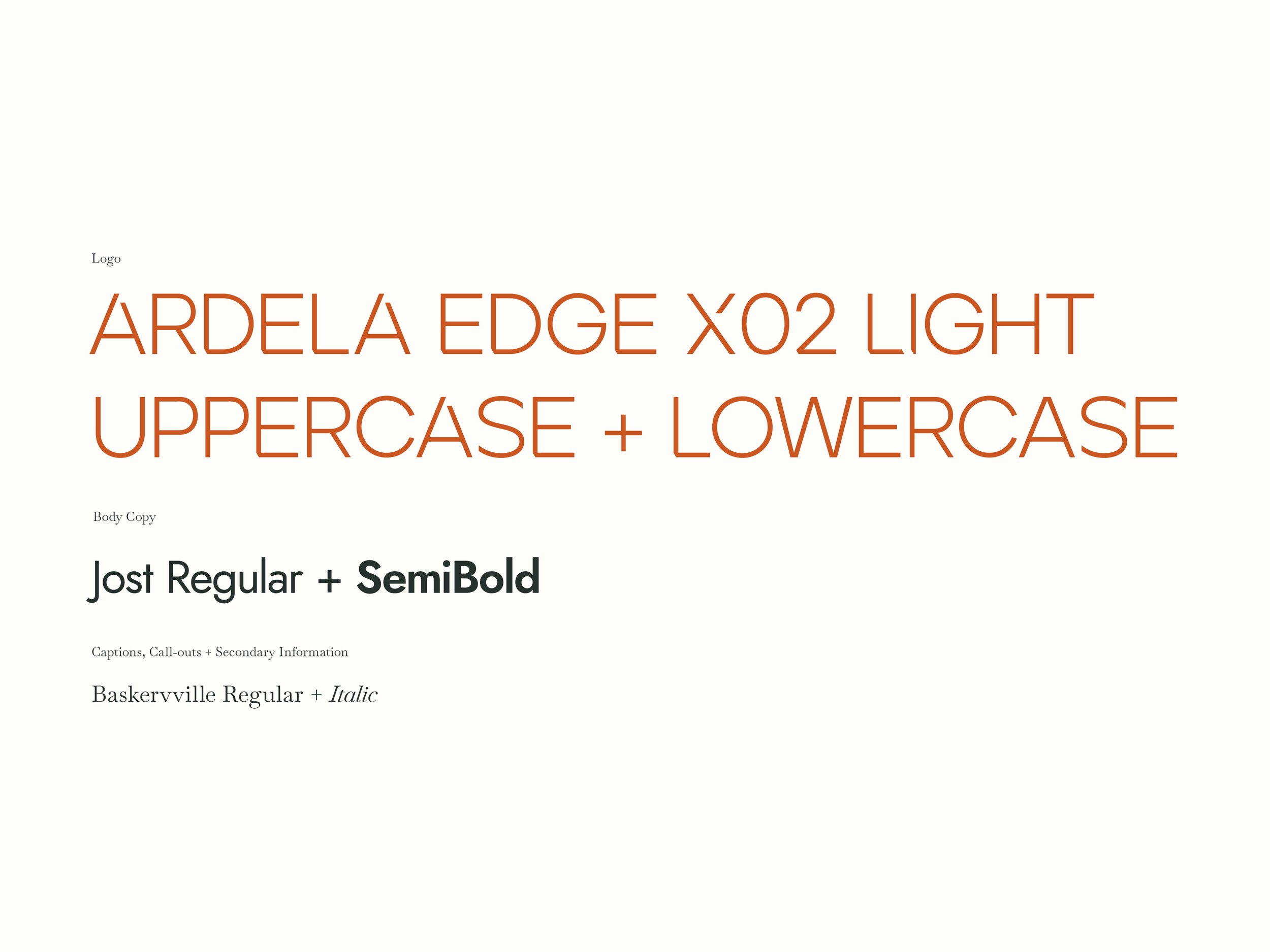
Lark + Bower's primary logo celebrates the unique features of the uppercase characters within the brand’s headline typeface Ardent Edge X02 using the typeface's stylised cuts, sharp angles, and interactive ligatures to create a recognisable, modern and quirky logo that is distinctive — but not distracting. 'Weft' lines have then been added alongside the 'A' and 'W' which are given space by the corner cut-outs of these letters. The brand’s colour palette consist of 6 pairs of colours used to identify the various weaving techniques the studio teaches. These colour pairings combined with specific technique icons are used to represent weaving techniques across instruction manuals, icons, web pages and social media.